

How to Design a Restaurant Website Menu Page That Looks Great and Works on Mobile
Your menu page is the single most visited page on your restaurant website. According to multiple usability studies, it is usually the first thing potential diners look for when they land on your site. Yet so many restaurant owners treat it as an afterthought, uploading a blurry PDF and calling it a day.
If you want to know how to design a restaurant website menu page that actually drives reservations and orders, this guide walks you through everything: layout choices, typography, mobile-first design, the PDF vs. HTML debate, and the most common mistakes you need to avoid in 2026 and beyond.
Why Your Menu Page Matters More Than You Think
Think of your online menu as a digital storefront. Before anyone walks through your door or places a delivery order, they check your menu. A poorly designed menu page can cost you customers in several ways:
- Slow loading times make people bounce, especially on mobile.
- Unreadable text (tiny fonts, low contrast) frustrates users.
- Missing prices erode trust and make diners choose a competitor.
- PDF-only menus are invisible to search engines, meaning you lose organic traffic.
Getting this page right is not optional. It is essential for both user experience and SEO.
HTML Menu vs. PDF Menu: Which Should You Use?
This is one of the most debated topics in restaurant website design, so let us settle it clearly.
The Case Against PDF Menus
Uploading a PDF of your printed menu is the fastest option, but it comes with serious downsides:
- Not mobile-friendly. PDFs require pinching and zooming on phones. Most of your visitors are on mobile devices.
- Not indexable by Google. While Google can crawl PDFs to some extent, the content inside them rarely ranks as well as native HTML text.
- Hard to update. Every time you change a dish or price, you need to regenerate the PDF, re-upload it, and hope the cached version clears.
- Accessibility issues. Screen readers struggle with most restaurant PDF menus, which means you are excluding visually impaired users.
The Case for HTML-Based Menus
An HTML menu is built directly into your web page using standard text, headings, and structured markup. The benefits are significant:
- Fully responsive. It adapts perfectly to any screen size.
- SEO-friendly. Google can read every dish name, description, and price, helping you rank for searches like “best pasta near me” or “vegan options in [your city].”
- Easy to update. Change a price or add a seasonal dish in seconds through your CMS.
- Faster load times. Text loads instantly compared to a multi-page PDF file.
Quick Comparison
| Feature | PDF Menu | HTML Menu |
|---|---|---|
| Mobile experience | Poor | Excellent |
| SEO value | Minimal | High |
| Ease of updating | Requires re-upload | Edit directly in CMS |
| Loading speed | Slow (large files) | Fast |
| Accessibility | Poor | Good (with proper markup) |
| Print-ready version | Yes | Needs separate file |
Our recommendation: Use an HTML-based menu as the default on your website. If you also want to offer a downloadable version for print, add a small “Download PDF” link as a secondary option, not the primary experience.
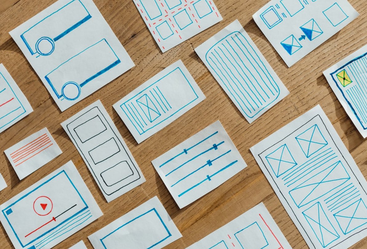
Choosing the Right Layout for Your Menu Page
The layout you choose depends on the size of your menu, the type of restaurant you run, and how you want diners to browse your offerings. Here are the most effective options.
1. Single-Column Layout
Best for: Restaurants with a concise menu (under 30 items).
A single-column layout lists categories one after another, scrolling vertically. It works beautifully on mobile because it mirrors the natural scroll behavior. Each section (appetizers, mains, desserts, drinks) gets its own heading, and items are listed beneath with a name, short description, and price.
2. Two-Column Layout
Best for: Mid-sized menus on desktop screens.
On larger screens, a two-column layout uses horizontal space efficiently, reducing the amount of scrolling. However, make sure the layout collapses to a single column on mobile. A two-column layout forced onto a small phone screen is a recipe for frustration.
3. Tabbed or Accordion Layout
Best for: Large menus with many categories (e.g., a diner or multi-cuisine restaurant).
Tabs at the top of the page (Lunch, Dinner, Drinks, Desserts) let visitors jump directly to the section they want. Accordion-style menus, where each category expands when tapped, work well on mobile by keeping the page compact. This approach reduces overwhelm and helps users find what they need quickly.
4. Grid or Card Layout
Best for: Restaurants that rely on food photography (bakeries, dessert shops, brunch spots).
Each menu item appears as a card with a photo, name, description, and price. This is visually appealing, but be careful: too many images can slow your page significantly. Optimize every photo (we will cover that below).

Typography and Readability: Making Your Menu Easy to Scan
A beautiful menu is useless if people cannot read it. Typography choices are critical.
Font Selection
- Use a clean, legible sans-serif font for item descriptions and prices. Fonts like Inter, Open Sans, or Lato work well on screens.
- If you want a more elegant feel, use a serif or display font only for headings (category names like “Appetizers” or “From the Grill”). Never use decorative script fonts for body text.
- Stick to two fonts maximum. One for headings, one for body text.
Font Size and Spacing
- Body text should be at least 16px on desktop and never smaller than 14px on mobile.
- Use generous line height (1.5 to 1.7 times the font size) so lines of text do not feel cramped.
- Add clear spacing between menu items. Each item should be visually distinct from the one above and below it.
Contrast and Color
- Dark text on a light background is the safest choice for readability.
- If you prefer a dark background (common for upscale restaurants), use white or very light text and ensure the contrast ratio meets WCAG AA standards (at minimum 4.5:1 for body text).
- Avoid placing text over busy background images. If you do, use a semi-transparent overlay to maintain readability.
Structuring Each Menu Item
For every dish, include these elements in a consistent format:
- Dish name (bold or slightly larger font)
- Short description (one to two lines covering key ingredients or preparation method)
- Price (clearly visible, aligned consistently)
- Dietary indicators (icons or labels for vegetarian, vegan, gluten-free, contains nuts, etc.)
Keep descriptions appetizing but brief. “Pan-seared salmon with roasted seasonal vegetables and lemon butter sauce” is perfect. A full paragraph is too much.
Designing Mobile-First: Your Menu Page Must Work on Phones
In 2026, well over 70% of restaurant website traffic comes from mobile devices. Designing mobile-first is not a trend; it is a requirement.
Key Mobile-First Principles for Menu Pages
- Start your design on a small screen. Build the mobile version first, then scale up for tablets and desktops, not the other way around.
- Use touch-friendly tap targets. If your menu has tabs or accordion sections, make sure buttons are at least 44×44 pixels so they are easy to tap with a finger.
- Eliminate horizontal scrolling. Everything should fit within the viewport width. No exceptions.
- Minimize the number of taps to reach the menu. Ideally, your menu should be accessible in one tap from the homepage. Even better, consider making the menu page your homepage.
- Test on real devices. Do not rely solely on browser emulators. Load your menu on an older Android phone, a mid-range iPhone, and a tablet to see how it actually performs.
Sticky Navigation for Long Menus
If your menu page is long, add a sticky navigation bar at the top that lets users jump between categories (Starters, Mains, Sides, Desserts, Drinks). As users scroll, this bar stays visible, making it easy to navigate without scrolling all the way back to the top.

Images on Your Menu Page: When to Use Them and How
Food photography can make or break a menu page. Here is how to handle it properly.
When to Use Photos
- Use photos if you have professional-quality images. Poorly lit, blurry phone photos do more harm than good.
- You do not need a photo for every item. Featuring photos for 5 to 10 signature dishes or popular items is often more effective than photographing your entire menu.
- Consider using a hero image at the top of the menu page to set the mood, then relying on text-based listings below.
Image Optimization
- Compress all images before uploading. Use modern formats like WebP or AVIF for smaller file sizes with minimal quality loss.
- Use lazy loading so images below the fold only load when the user scrolls to them.
- Always include alt text that describes the dish. This helps with SEO and accessibility (e.g., alt=”Grilled lamb chops with mint yogurt sauce”).
- Keep image file sizes under 200KB each whenever possible.
Common Mistakes Restaurant Owners Make with Online Menus
After years of building restaurant websites, we have seen the same problems over and over. Here are the biggest mistakes to avoid.
Mistake 1: Using Only a PDF Menu
We covered this above, but it bears repeating. A PDF-only menu is the number one mistake we see. It hurts your SEO, frustrates mobile users, and makes updates painful. Always have an HTML version as your primary menu.
Mistake 2: Hiding the Menu Behind Too Many Clicks
Some restaurant websites bury the menu under nested navigation (Home > About > Our Food > Menu). Your menu link should be in the main navigation bar and labeled clearly as “Menu.” Do not get creative with the label. “Our Culinary Journey” is not a replacement for “Menu.”
Mistake 3: Not Including Prices
Leaving off prices makes visitors suspicious. They may assume the restaurant is too expensive or simply leave to find a competitor that is upfront about costs. Always list prices unless you are running an ultra-high-end tasting-menu-only establishment, and even then, showing the tasting menu price is a good practice.
Mistake 4: Outdated Menu Information
Nothing damages trust faster than a customer arriving expecting a dish they saw online, only to learn it was removed months ago. Keep your online menu current. If your menu changes seasonally, set a reminder to update your website at the start of each season.
Mistake 5: Ignoring Dietary Information
Modern diners expect to see dietary indicators. Use simple icons or text labels for common dietary needs:
- (V) Vegetarian
- (VG) Vegan
- (GF) Gluten-Free
- (DF) Dairy-Free
- Contains common allergens (nuts, shellfish, etc.)
Add a legend at the top or bottom of the menu explaining what each icon means.
Mistake 6: Slow Page Load Speed
Large, uncompressed images and bloated scripts can make your menu page load in 5+ seconds. On mobile networks, this gets even worse. Aim for a page load time of under 3 seconds. Use Google PageSpeed Insights to test your page and follow its recommendations.
Mistake 7: No Clear Call to Action
Your menu page should lead somewhere. After browsing the menu, what should the visitor do next? Include clear calls to action like:
- “Order Online” button
- “Reserve a Table” button
- “Call Us” click-to-call button (especially on mobile)
Structured Data: Help Google Understand Your Menu
Adding schema markup (structured data) to your menu page helps search engines understand your content better. Google can use this data to display rich results, like showing your menu items directly in search results.
Use the Restaurant and Menu schema types from schema.org. Key properties to include:
- Restaurant name, address, and phone number
- Menu sections (categories)
- Individual menu items with names, descriptions, and prices
- Dietary restrictions if applicable
If you are using WordPress, plugins like Yoast SEO or Rank Math can help you add schema without touching code. For custom-built sites, you can implement JSON-LD markup directly.
A Practical Checklist for Your Restaurant Menu Page
Use this checklist before launching or redesigning your menu page:
| Item | Done? |
|---|---|
| Menu is HTML-based (not PDF-only) | ☐ |
| Page loads in under 3 seconds on mobile | ☐ |
| All prices are listed and up to date | ☐ |
| Dietary indicators are present | ☐ |
| Images are compressed and use WebP/AVIF format | ☐ |
| Layout works on mobile without horizontal scrolling | ☐ |
| Menu link is in the main navigation and labeled “Menu” | ☐ |
| Clear call to action (Order / Reserve / Call) | ☐ |
| Schema markup added for restaurant and menu | ☐ |
| Tested on real mobile devices | ☐ |

Tools and Platforms to Build Your Menu Page
If you are not building from scratch, here are some popular approaches in 2026:
- WordPress + a restaurant theme or plugin: Themes like flavor or flavor starter come with built-in menu management. Plugins like flavor menu or flavor restaurant menu let you build structured, categorized menus easily.
- Squarespace: Offers clean restaurant templates with built-in menu sections. Easy for non-technical owners.
- Wix: Their restaurant templates include dedicated menu builders. Good for simple setups.
- Custom development: If you need full control, a custom-built HTML/CSS menu using a framework like Express.js for the backend gives you maximum flexibility and performance.
Whatever platform you use, the principles in this guide remain the same.
Frequently Asked Questions
Should I use a PDF or HTML menu on my restaurant website?
Use an HTML-based menu as your primary format. It is mobile-friendly, SEO-friendly, accessible, and easy to update. You can offer a PDF as a secondary download option, but it should never be the only way visitors can view your menu.
How often should I update my online menu?
Update your menu every time you make a change, no matter how small. If your menu changes seasonally, update it at the start of each season. If you run daily specials, consider a dedicated section on your menu page that is easy to edit.
Do I need photos of every dish on my menu page?
No. Only use photos if they are high quality and professionally shot. Featuring 5 to 10 signature dishes with photos is usually more effective than photographing everything. Bad food photos can actually deter customers.
What is the best menu layout for mobile devices?
A single-column layout with clear category headings works best on mobile. For larger menus, use a tabbed or accordion layout so users can quickly jump to the section they want without excessive scrolling.
How can I make my menu page load faster?
Compress all images (use WebP or AVIF format), enable lazy loading, minimize the use of custom fonts, reduce JavaScript, and use a fast hosting provider. Test your page speed with Google PageSpeed Insights and aim for a load time under 3 seconds.
Should I include prices on my online menu?
Yes, always. Visitors expect to see prices, and omitting them creates distrust. Transparent pricing also helps potential customers self-qualify before visiting your restaurant, leading to a better experience for everyone.
What is schema markup and do I need it for my menu page?
Schema markup is structured data you add to your HTML that helps search engines understand your content. For restaurant menus, it can lead to richer search results. While not strictly required, it gives you a competitive advantage in search visibility and is strongly recommended.