How to Design a Hero Section That Converts: Layout, Copy, and CTA Best Practices
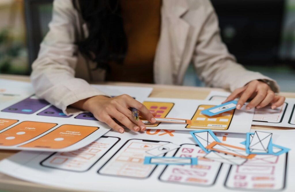
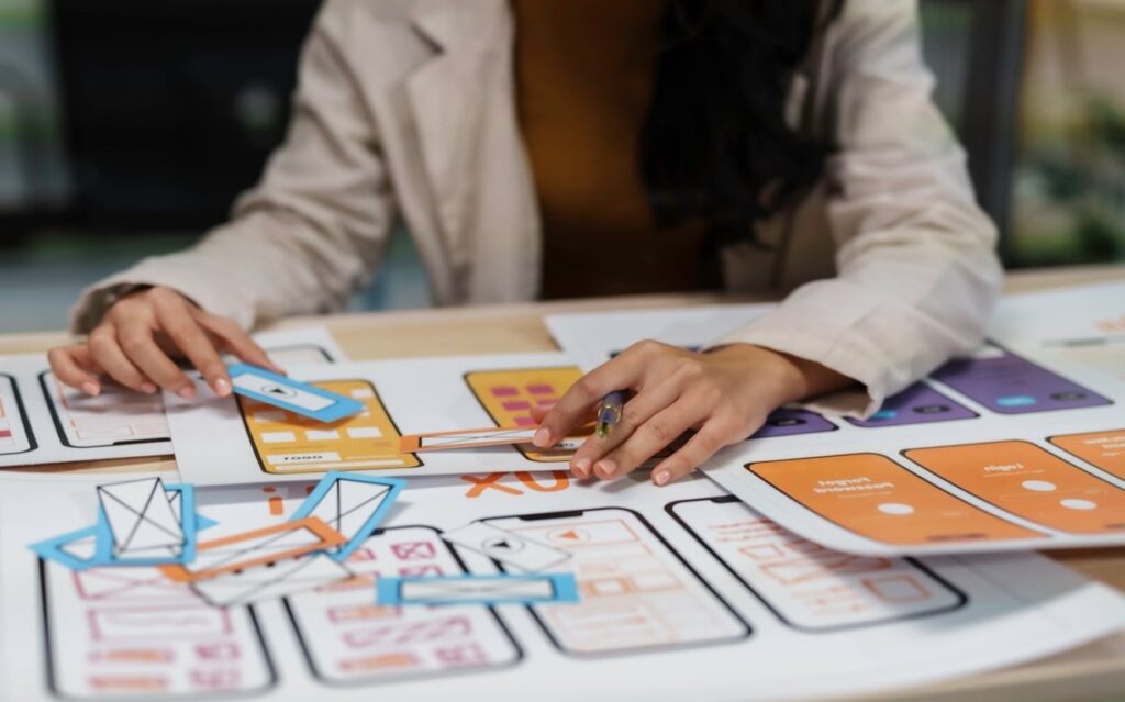
How to Design a Hero Section That Actually Converts Your hero section is the first thing visitors see when they land on your website. It occupies the most valuable digital real estate you have, and it needs to do one job extremely well: convince people to stay and take action. Whether you are building a SaaS landing page, an e-commerce storefront, or a portfolio site, learning how to design a hero section that converts is one of the highest-leverage skills in web design. In this guide, we break down layout patterns, headline writing formulas, CTA button best practices, background imagery choices, and mobile responsiveness tips. We also include real examples of effective hero sections across different industries and explain exactly why they work. What Is a Hero Section and Why Does It Matter? A hero section is the large, prominent area at the top of a webpage, typically spanning 60% to 100% of the viewport height on desktop. It sits above the fold and is designed to capture attention, convey the site’s main purpose, and guide visitors toward a primary action. Here is why it matters so much: First impressions form in under 50 milliseconds. Your hero section is your handshake with the visitor. It sets the visual and emotional tone for the entire website experience. It is your highest-visibility conversion opportunity. More eyes land on the hero than on any other section of your page. It reduces bounce rates when done well, because visitors immediately understand what you offer and why it matters. Getting it wrong means visitors leave before scrolling. Getting it right means they click, sign up, or buy. The 5 Core Elements of a High-Converting Hero Section Before we dive into layout patterns and examples, let’s establish the building blocks. Every effective hero section contains these five elements working together: Element Purpose Key Consideration Headline Communicate what you offer and why it matters Clarity over cleverness, always Subheadline Add context, specificity, or social proof Keep it to 1-2 sentences maximum CTA Button(s) Drive the primary action you want visitors to take One primary CTA, optionally one secondary Visual (Image/Video) Reinforce the message and create emotional impact Must complement, not compete with, the text Trust Indicators Reduce friction and build credibility Logos, ratings, user counts, or micro-testimonials Now let’s explore each of these in depth. Hero Section Layout Patterns That Work in 2026 When figuring out how to design a hero section, layout is where most people start, and for good reason. The arrangement of your elements determines how visitors process information and where their eyes naturally travel. 1. The Split Layout (Text Left, Visual Right) This is the most popular and reliable hero layout. The left side contains the headline, subheadline, and CTA. The right side features a product screenshot, illustration, or photo. Why it works: In left-to-right reading cultures, the eye naturally starts on the left. Placing your value proposition there ensures it gets read first. The visual on the right reinforces the message and provides context. Best for: SaaS products, tech companies, B2B services, apps. 2. The Centered Layout All text is centered on the page with the CTA button directly below. A background image, gradient, or video sits behind the text. Why it works: It creates a clean, focused hierarchy. There is no visual competition. The visitor reads the headline, then the subheadline, then clicks the button. It follows a natural vertical scanning pattern. Best for: Landing pages, event websites, product launches, portfolios. 3. The Full-Screen Video Background A looping video fills the entire hero section with a semi-transparent overlay and centered text on top. Why it works: Motion captures attention. When the video directly shows the product in use or the experience being sold, it can be incredibly persuasive. Best for: Travel, hospitality, real estate, lifestyle brands. Caution: Video backgrounds must be optimized for performance. A slow-loading hero destroys conversions. 4. The Product-Focused Layout The hero section features a large product image or device mockup as the central element, with minimal text above or below. Why it works: When the product itself is visually compelling, letting it take center stage can be more persuasive than any headline. Apple has used this approach for decades. Best for: Physical products, hardware, consumer electronics, fashion. 5. The Interactive or Animated Hero Elements animate in as the page loads, or the hero contains an interactive component like a search bar, calculator, or configurator. Why it works: Interactive elements increase engagement and time on page. They also let visitors self-qualify and get value immediately. Best for: Travel booking sites, real estate platforms, financial tools, comparison services. How to Write Hero Section Headlines That Convert Your headline is the single most important piece of copy on your entire website. If it fails, nothing else matters. Here are proven formulas for writing hero section headlines: Formula 1: Say What You Are This sounds obvious, but an astonishing number of websites fail at this basic task. Your headline should tell visitors exactly what you do in plain language. Example: “Project management software for remote teams” is better than “Reimagine the future of work.” Formula 2: Lead With the Benefit Instead of describing what your product is, describe what it does for the customer. Example: “Get paid 3x faster with automated invoicing” instead of “Automated invoicing software.” Formula 3: Address the Pain Point Call out the problem your audience is experiencing, then position your product as the solution. Example: “Tired of losing deals to slow follow-ups? Automate your outreach in minutes.” Formula 4: Use Specificity and Numbers Specific claims are more believable than vague ones. Numbers add credibility. Example: “Join 50,000+ marketers who increased their conversion rates by 37%.” Headline Writing Best Practices Keep it under 10 words if possible. Shorter headlines get read more. Use simple, everyday language. Avoid jargon unless your audience expects it. Make your offer different. As one popular framework puts it: say what you are, then say what makes your offer different. Follow the “one
How to Design a Hero Section That Converts: Layout, Copy, and CTA Best Practices Read More »