


A squeeze page is a single-purpose landing page built to do exactly one thing: collect an email address. No navigation bar, no pricing table, no blog links, no footer sitemap. One offer, one form, one decision.
Most articles on squeeze page design show you screenshots and tell you to “keep it simple.” This guide does something different: it walks through the page one element at a time, explains the conversion logic behind each decision, and ends with a complete HTML and CSS layout you can copy, paste and ship today, plus the Express route that receives the submission.
What is a squeeze page (and how it differs from a landing page)
A squeeze page is a subset of landing pages. Every squeeze page is a landing page, but not every landing page is a squeeze page. The difference is the conversion goal and the amount of information requested.
| Aspect | Squeeze page | Standard landing page |
|---|---|---|
| Goal | Capture an email address | Demo request, purchase, trial, booking |
| Form fields | 1 (sometimes 2) | 4 to 10 |
| Page length | One screen, rarely more | Long form, multiple sections |
| Navigation | Removed entirely | Often reduced, sometimes kept |
| Typical offer | Checklist, template, mini-course, waitlist | Product, service, webinar, consultation |
| Success metric | Opt-in rate | Cost per lead, revenue per visitor |
Practical consequence: every design choice on a squeeze page is judged against a single question. Does this element make typing an email address more likely, or less? If the answer is “less” or “neutral,” delete it.
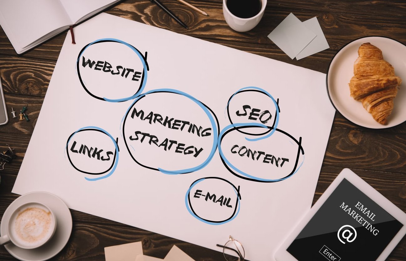
The anatomy of a high-converting squeeze page
Here is the full element stack, in the order a visitor processes it. Build in this order too.
| # | Element | Job it does |
|---|---|---|
| 1 | Eyebrow label | Categorises the offer in two words (“Free download”) |
| 2 | Headline | Promises one specific outcome |
| 3 | Subheadline | Names the deliverable and who it is for |
| 4 | 3 benefit bullets | Makes the value concrete and scannable |
| 5 | Email field | The only input on the page |
| 6 | CTA button | Restates the reward, not the action |
| 7 | Privacy microcopy | Removes the “will I get spammed” objection |
| 8 | Proof element | Subscriber count, logo row or one short quote |
| 9 | Visual of the asset | Makes an intangible file feel real |
| 10 | Thank-you page | Confirms delivery and sets the next step |
1. One offer, and only one
The fastest way to kill a squeeze page is to offer a checklist and a newsletter and a webinar seat. Each extra option forces a comparison, and comparison costs attention.
Pick one asset that solves a single, narrow problem your traffic already has. Narrow beats broad every time:
- Weak: “Subscribe to our developer newsletter”
- Strong: “The 12-point Node.js performance checklist we run before every deploy”
The second version works because the visitor can picture the file, estimate the time cost of reading it, and judge the trade against one email address in about three seconds.
2. Remove the navigation
A header menu on a squeeze page is an exit ramp. Every link competes with the form. Strip the following:
- Primary navigation and dropdowns
- Footer sitemap and category lists
- Sidebar widgets, recent posts, search box
- Social sharing icons that point away from the page
- Chat bubbles that cover the mobile CTA
Keep only what the law and trust require: a logo (unlinked or linked to the same page), a privacy policy link and, if relevant, your cookie notice. If your legal team insists on a terms link, put it in small text under the form, not in a header.
3. Put the form above the fold
Visitors should never scroll to find the input. On a 667px tall mobile viewport, the headline, the email field and the button must all be visible at once. That constraint shapes everything else: it is why benefit bullets are three lines and not eight, and why the hero image is small or absent on mobile.
A reliable test: load the page on a phone, and if your thumb has to move before you can tap the field, the layout is too tall.
4. Ask for one field
Every additional field reduces completion. First name feels harmless, but it adds a decision (“do I give my real name?”) and a second tap on mobile. If you need a name for personalisation, collect it on the thank-you page or in the first email, after commitment already exists.
Field rules that matter more than people think:
- Use
type="email"so mobile keyboards show the @ key - Add
autocomplete="email"so browsers autofill in one tap - Keep the label present for screen readers, visually hidden if space is tight
- Validate on submit, not on every keystroke, and never with a red border before the user has finished typing
- Use a hidden honeypot field instead of a CAPTCHA, which can cost double-digit percentages of conversions
5. Write copy that reduces friction, not copy that sells harder
On a squeeze page you are not selling a product, you are lowering the perceived cost of handing over an email. Friction comes in four flavours: effort, risk, doubt and delay. Each has a copy antidote.
| Friction | Visitor thought | Copy antidote |
|---|---|---|
| Effort | “How long will this take me?” | “A 2-page checklist. Readable in 4 minutes.” |
| Risk | “Am I signing up for daily spam?” | “One email. No sequence unless you ask for it.” |
| Doubt | “Is this actually any good?” | “Used by 4,100 engineering teams” or one short quote |
| Delay | “When do I get it?” | “Delivered instantly, no confirmation hoops” |
Headline formulas that hold up
- Outcome + timeframe: “Cut your API response time by 40% in one afternoon”
- Asset + audience: “The deployment checklist for teams shipping Node.js on Fridays”
- Problem removal: “Stop guessing which middleware is slowing your app down”
- Curiosity with specifics: “The 4 Express mistakes that add 200ms to every request”
Button copy
Never write “Submit.” The button should describe what the visitor receives, in first person or imperative, and should match the headline promise:
- “Send me the checklist”
- “Get the template”
- “Start lesson 1”
Avoid “Sign up” and “Register.” Both imply ongoing obligation, which is exactly the fear you are trying to remove.
6. Add one proof element, not five
Proof reassures, but a wall of logos pushes the form below the fold. One of these is enough:
- A subscriber count, if it is real and above a few thousand
- A single sentence testimonial with a name and role
- Three client logos in grayscale at small size
7. Design the thank-you page as part of the funnel
The thank-you page is where the squeeze page stops being minimal. Here you can ask for the next step: follow on social, read a related article, book a call, or confirm the inbox folder to check. Conversions you cannot get before the opt-in often happen one second after it.

A minimal squeeze page layout you can copy
This is a complete, dependency-free page. Single column, centred card, mobile-first, with a horizontal form on wider screens. It renders in under 5KB of CSS and passes basic accessibility checks.
The HTML
<!doctype html>
<html lang="en">
<head>
  <meta charset="utf-8">
  <meta name="viewport" content="width=device-width, initial-scale=1">
  <title>Free Node.js performance checklist</title>
  <meta name="robots" content="noindex">
  <link rel="stylesheet" href="/squeeze.css">
</head>
<body>
  <main class="squeeze">
    <section class="card">
      <p class="eyebrow">Free download</p>
      <h1>Cut your API response time by 40% in one afternoon</h1>
      <p class="sub">The 12-point checklist we run on Express apps serving 3M requests a day.</p>

      <ul class="benefits">
        <li>The 4 middleware mistakes that add 200ms per request</li>
        <li>A copy-paste caching layer for your hottest routes</li>
        <li>How to profile a slow endpoint in under 10 minutes</li>
      </ul>

      <form class="optin" method="post" action="/subscribe" novalidate>
        <label class="sr-only" for="email">Email address</label>
        <input id="email" name="email" type="email" autocomplete="email"
               inputmode="email" placeholder="[email protected]" required>
        <input class="hp" type="text" name="website" tabindex="-1"
               autocomplete="off" aria-hidden="true">
        <button type="submit">Send me the checklist</button>
      </form>

      <p class="micro">One email, no sequence. Unsubscribe in one click.</p>
      <p class="proof">Joined by 4,100 engineers this year.</p>
    </section>
  </main>
</body>
</html>
The CSS
:root{
  --ink:#10131a;
  --muted:#5b6472;
  --accent:#1f6feb;
  --bg:#f4f6fb;
  --radius:14px;
}
*,*::before,*::after{box-sizing:border-box}

body{
  margin:0;
  font-family:system-ui,-apple-system,"Segoe UI",Roboto,sans-serif;
  color:var(--ink);
  background:var(--bg);
  line-height:1.55;
  -webkit-font-smoothing:antialiased;
}

.squeeze{
  min-height:100svh;
  display:grid;
  place-items:center;
  padding:24px 16px;
}

.card{
  width:100%;
  max-width:560px;
  background:#fff;
  padding:40px 28px;
  border-radius:var(--radius);
  box-shadow:0 10px 40px rgba(16,19,26,.08);
}

.eyebrow{
  margin:0 0 10px;
  font-size:.78rem;
  letter-spacing:.09em;
  text-transform:uppercase;
  font-weight:700;
  color:var(--accent);
}

h1{
  margin:0 0 12px;
  font-size:clamp(1.6rem,4.6vw,2.25rem);
  line-height:1.15;
  letter-spacing:-.02em;
}

.sub{margin:0 0 20px;color:var(--muted);font-size:1.05rem}

.benefits{margin:0 0 26px;padding-left:1.1rem}
.benefits li{margin-bottom:6px}

.optin{display:flex;flex-direction:column;gap:12px}

.optin input[type=email]{
  width:100%;
  padding:14px 16px;
  font-size:1rem;
  border:1px solid #d6dbe4;
  border-radius:10px;
  background:#fff;
}

.optin input[type=email]:focus{
  outline:3px solid rgba(31,111,235,.25);
  border-color:var(--accent);
}

.optin button{
  padding:15px 18px;
  font-size:1.05rem;
  font-weight:700;
  color:#fff;
  background:var(--accent);
  border:0;
  border-radius:10px;
  cursor:pointer;
}

.optin button:hover{filter:brightness(1.08)}

.micro{margin:14px 0 0;font-size:.85rem;color:var(--muted);text-align:center}
.proof{margin:6px 0 0;font-size:.85rem;color:var(--muted);text-align:center}

.hp{position:absolute;left:-9999px}

.sr-only{
  position:absolute;width:1px;height:1px;
  overflow:hidden;clip:rect(0 0 0 0);white-space:nowrap;
}

@media (min-width:640px){
  .card{padding:48px 44px}
  .optin{flex-direction:row}
  .optin input[type=email]{flex:1}
}

@media (prefers-reduced-motion:no-preference){
  .optin button{transition:filter .15s ease}
}
The Express route that receives it
A squeeze page is only half the system. Here is a compact handler with honeypot filtering, normalisation and a POST-redirect-GET pattern so refreshing the thank-you page does not resubmit:
import express from 'express';
import rateLimit from 'express-rate-limit';

const app = express();
app.use(express.urlencoded({ extended: false }));

const optinLimiter = rateLimit({ windowMs: 60_000, max: 10 });
const EMAIL = /^[^@\s]+@[^@\s]+\.[a-z]{2,}$/i;

app.post('/subscribe', optinLimiter, async (req, res, next) => {
  try {
    const { email = '', website = '' } = req.body;

    // Honeypot: real users never fill this hidden field
    if (website.trim() !== '') return res.redirect(303, '/thanks');

    const clean = email.trim().toLowerCase();
    if (!EMAIL.test(clean)) {
      return res.status(422).render('squeeze', {
        error: 'That email address does not look right. Try again?'
      });
    }

    await addSubscriber(clean, { source: 'perf-checklist', ts: Date.now() });
    return res.redirect(303, '/thanks');
  } catch (err) {
    next(err);
  }
});

app.listen(3000);
Two details worth keeping: the 303 status (not 302) forces the browser to switch to GET, and the error path re-renders the same page with the email preserved rather than dumping the user on a blank error screen.
Common mistakes that kill opt-in rates
- Leaving the site header in place. The single biggest leak. If the template forces a header, override it with a dedicated page template.
- Asking for first name, last name, company and role. Each field is a tax on a page whose only job is an email.
- A vague headline. “Join our community” tells the visitor nothing about what arrives in the inbox.
- Hero image that pushes the form below the fold on mobile. Test at 360×640, not on your 27-inch monitor.
- Low-contrast CTA. The button should be the highest contrast object on screen. Pale grey outlines convert badly.
- CAPTCHA before submission. Use a honeypot plus rate limiting. Save the challenge for pages under actual attack.
- No privacy reassurance. One sentence under the button handles the biggest unstated objection.
- Double opt-in with no explanation. If you require confirmation, say so on the thank-you page and describe the subject line of the email to look for.
- Slow page. Every heavy font, tracker and video embed delays first paint. Keep the page under 100KB and the form will still be there when attention is.
- Traffic and offer mismatch. A checklist about caching promoted to an audience searching for hiring advice will underperform no matter how good the design is.
- Indexing the page. Thin, duplicate-ish squeeze pages compete with your real content. Add
noindexunless the page is genuinely built to rank. - No analytics on the form. If you cannot see field-level drop-off, you are testing blind.
What conversion rate should you expect?
Opt-in rates vary enormously by traffic source. These ranges are what most teams report in practice:
| Traffic source | Typical opt-in rate | Good result |
|---|---|---|
| Your own email list | 30% to 50% | 50%+ |
| In-content links from your blog | 15% to 30% | 30%+ |
| Paid search, high intent | 10% to 20% | 20%+ |
| Paid social, cold | 3% to 10% | 10%+ |
| Organic search, cold | 2% to 8% | 8%+ |
Compare your page against its own history and its own traffic source, not against a benchmark from a different channel.

What to test first
Test in this order, because the impact per test drops sharply as you move down the list:
- The offer itself. Swapping a generic ebook for a specific template often doubles the rate. Nothing in CSS competes with that.
- The headline. Specific outcome versus generic benefit.
- Number of form fields. Two fields down to one.
- Button copy. Reward-oriented versus action-oriented.
- Proof placement. Above the form versus below it.
- Colour and spacing. Real, but smallest effect. Save it for last.
Run one test at a time, and wait for a few hundred conversions per variant before calling a winner. Most “wins” announced after 40 conversions are noise.

Pre-launch checklist
- Form visible without scrolling at 360×640
- Navigation, footer links and sidebar removed
- One field, labelled, with correct
typeandautocomplete - Button copy names the reward
- Privacy sentence under the button
- Honeypot plus server-side rate limit active
- Validation errors return the user to a filled form, not a blank one
- Thank-you page exists and confirms delivery timing
- Delivery email tested in Gmail, Outlook and Apple Mail
- Page loads in under 1.5 seconds on a mid-range phone
noindexapplied unless the page is built to rank- Conversion event firing in analytics
FAQ
What is a squeeze page?
A squeeze page is a single-purpose landing page whose only goal is to collect an email address in exchange for something of value, usually a free download, mini-course or waitlist spot. It has no navigation and typically one form field.
What is the difference between a landing page and a squeeze page?
A landing page can pursue any conversion goal and often asks for several pieces of information. A squeeze page is the narrowest form of landing page: one offer, one field, one button, usually on one screen. Think of the squeeze page as the minimum viable landing page.
How many form fields should a squeeze page have?
One. Email only. If personalisation matters, ask for the first name on the thank-you page or in the welcome email, after the visitor has already committed.
Should a squeeze page have navigation?
No. Remove the header menu, sidebar and footer links. Keep only the logo and a privacy policy link. Every other link is a route away from the form.
Can AI tools build a squeeze page for me?
AI assistants can generate workable HTML and CSS in seconds, and the template in this article is a good starting prompt to refine. What they cannot do is choose an offer your specific audience wants, or write the one sentence that removes their specific objection. Use AI for the markup, do the offer and the copy yourself, then test.
Do I need a page builder?
No. The template above is plain HTML and CSS with no framework and no build step. Builders are useful when non-technical teammates need to edit pages frequently, but for a developer, a static file plus a POST route ships faster and loads faster.
Should a squeeze page be indexed by Google?
Usually not. Thin single-purpose pages rarely rank and can dilute your site. Add noindex and drive traffic from ads, email, your blog content and social. The exception is a genuinely substantial resource page built around a search term with real content on it.
What is a good squeeze page conversion rate?
It depends on the source. Warm traffic from your own list can convert 30% to 50%. Cold paid social is often in the 3% to 10% range. Track your own baseline per channel and improve against that.
Wrapping up
Good squeeze page design is subtraction. Start with one offer worth an email address, remove everything that is not the headline, three bullets, one field and one button, then write copy that answers “how long, how risky, how good, how soon.” The layout in this article gives you the skeleton. The offer and the first sentence are where the real conversion lift lives.
Copy the HTML, paste the CSS, wire the Express route, and ship it today. Then test the offer before you test the button colour.