

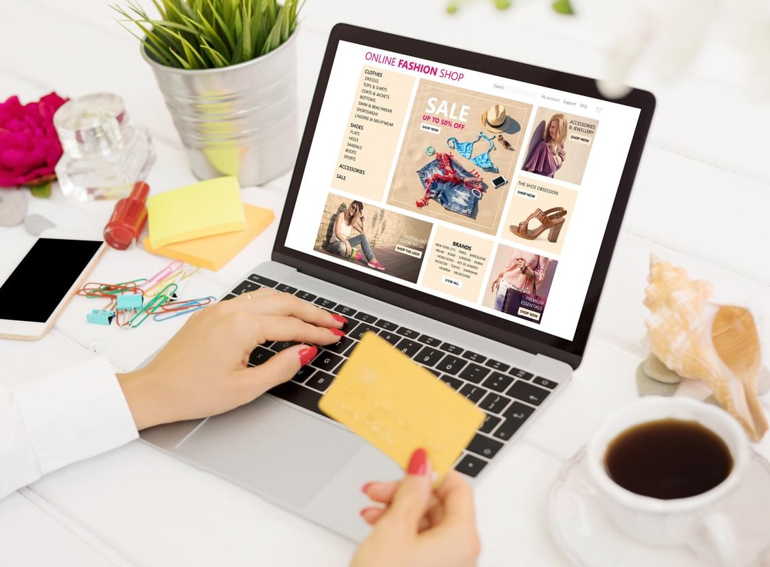
Cart abandonment remains one of the most expensive problems in e-commerce. According to recent industry data, nearly 70% of online shoppers abandon their carts before completing a purchase, and a significant portion of those drop-offs happen on the checkout page itself. The good news? Most abandonment is preventable through smart design choices.
In this guide, we walk through the most effective checkout page design best practices that directly lower abandonment rates. Each tip is actionable, backed by UX research, and ready to implement on your store today.
Why Checkout Page Design Matters More Than Ever
Your checkout is the final step between intent and revenue. Even a small amount of friction can cost you thousands in lost sales. Modern shoppers expect a fast, secure, and transparent experience. If your checkout feels clunky, suspicious, or slow, they will close the tab and likely never return.
The most common reasons customers abandon checkout include:
- Unexpected shipping costs or fees
- Being forced to create an account
- Long or complicated checkout forms
- Concerns about payment security
- Slow page loads, especially on mobile
- Limited payment options
Let’s tackle each of these head-on.
1. Offer Guest Checkout (and Make It Obvious)
Forcing account creation is one of the top reasons users abandon a purchase. Make guest checkout the most prominent option, not a hidden link buried below a sign-up form.
Best practice: place the guest checkout button at the top, with equal or greater visual weight than the “Create an Account” option. You can always invite users to create an account after the purchase is complete, using their existing email and a single-click password setup.
What to Avoid
- Mandatory registration before purchase
- Complex password requirements (12+ characters, special symbols, etc.)
- Hiding the guest option in a small text link
2. Simplify Your Form Fields
Every extra field is a potential drop-off point. Audit your checkout form and remove anything that is not strictly necessary. A typical optimized checkout should have between 7 and 12 form fields, not 20+.
Quick wins to simplify forms:
- Combine “First Name” and “Last Name” into one “Full Name” field when possible
- Use address autocomplete (Google Places API or similar)
- Auto-detect country based on IP
- Hide the “Company Name” field behind an optional toggle
- Use a single shipping address by default, with a checkbox for “billing address is different”
3. Display a Clear Progress Indicator
Shoppers want to know how much effort remains before they can finish. A clear progress bar reduces anxiety and signals that the process is short.
For multi-step checkouts, use a horizontal progress indicator with 3 to 4 clear steps such as:
Cart → Shipping → Payment → Confirmation
For single-page checkouts, use clear section anchors and visual cues like checkmarks when each section is complete.
4. Show Trust Badges and Security Signals
At the moment of payment, trust is everything. Display visible security indicators near credit card fields and CTA buttons.
Effective trust signals include:
- SSL padlock icons and “Secure Checkout” labels
- Accepted payment method logos (Visa, Mastercard, PayPal, Apple Pay, etc.)
- Money-back guarantee or return policy badges
- Recognized security certifications (Norton, McAfee, Trustpilot)
- Customer review stars or testimonials in the order summary
5. Be Transparent About Total Cost Early
Surprise fees are the number one cause of abandonment. Show shipping, taxes, and any additional charges as early as possible, ideally before the user enters payment details.
Use a sticky order summary on desktop and a collapsible summary on mobile so the total is always visible. Include:
- Itemized product costs
- Shipping fees (with delivery date estimate)
- Applicable taxes
- Discounts applied
- Final total in large, bold typography
6. Optimize for Mobile First
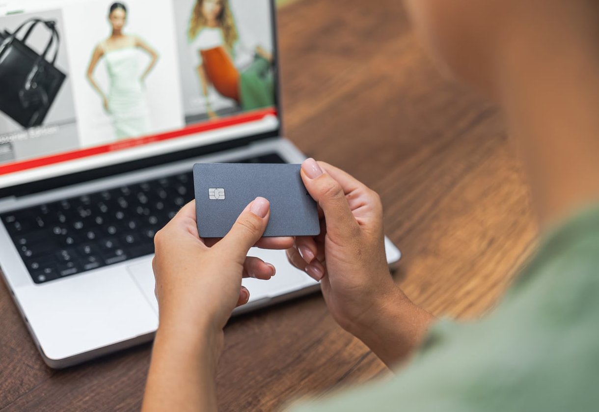
In 2026, more than 72% of e-commerce traffic comes from mobile devices. Your checkout must be designed mobile-first, not adapted as an afterthought.
Mobile checkout essentials:
- Large, thumb-friendly buttons (minimum 44×44 pixels)
- Numeric keyboards for phone, ZIP code, and card fields
- Single-column layout
- Apple Pay, Google Pay, and Shop Pay express checkout buttons at the top
- Auto-formatting for credit card numbers and expiry dates
7. Provide Multiple Payment Options
Limiting payment methods is the same as turning customers away. Modern checkouts should support a flexible mix.
| Payment Type | Why It Matters |
|---|---|
| Credit & Debit Cards | Still the most-used method globally |
| Digital Wallets (Apple Pay, Google Pay) | One-tap checkout drastically reduces friction |
| Buy Now, Pay Later (Klarna, Afterpay) | Boosts average order value by 30-50% |
| PayPal | Trusted by 400+ million users worldwide |
| Local Methods (iDEAL, SEPA, etc.) | Essential for international expansion |
8. Use Real-Time Form Validation
Nothing is more frustrating than filling out an entire form, hitting submit, and being told an error occurred several fields back. Validate inputs in real time as the user types.
Best practices:
- Show green checkmarks when a field is correctly filled
- Display inline error messages directly below the problematic field
- Use clear, human-readable error text (“Please enter a valid email” rather than “ERROR 422”)
- Never clear the form on error
9. Remove Distractions from the Checkout Page
Once a user enters checkout, your only goal is conversion. Strip out unnecessary navigation, sidebars, banners, and upsells that could lure them away.
Keep these minimal elements visible:
- Your logo (linking back to home only if absolutely needed)
- The progress indicator
- Order summary
- Support contact (live chat or phone)
- Trust badges
10. Offer Express Checkout at the Top
Place express options like Shop Pay, Apple Pay, Google Pay, and PayPal Express at the very top of your checkout. Returning customers can complete a purchase in seconds without filling in any form.
This single change has been shown to lift conversion rates by up to 50% on mobile.

11. Add Reassurance Copy Near the CTA
Small pieces of microcopy can dramatically reduce hesitation. Near your “Place Order” button, include short, reassuring messages such as:
- “Free returns within 30 days”
- “Your payment is securely encrypted”
- “You won’t be charged until you confirm”
- “Estimated delivery: June 18 to June 21”
12. Test, Measure, and Iterate
The best checkout pages are never “finished.” Run continuous A/B tests on:
- Button colors and copy (“Buy Now” vs “Complete Order” vs “Pay $XX.XX”)
- Single-page vs multi-step checkout
- Position of trust badges
- Field labels and placeholder text
- Express checkout placement
Use tools like heatmaps, session recordings, and funnel analytics to identify where users hesitate or drop off.
Checkout Design Quick Checklist
| Element | Best Practice |
|---|---|
| Guest Checkout | Prominent and default option |
| Form Fields | 7 to 12 maximum |
| Progress Bar | Visible at all times |
| Trust Badges | Near payment & CTA |
| Mobile UX | Single column, large buttons |
| Payment Options | At least 4 methods including digital wallets |
| Validation | Real-time and inline |
| Distractions | Removed entirely |
Final Thoughts
Reducing cart abandonment is rarely about a single magic fix. It is about removing dozens of tiny friction points across your entire checkout flow. By applying these best practices, simplifying forms, building trust, offering guest checkout, optimizing mobile experience, and giving customers flexibility in how they pay, you can recover a significant portion of lost revenue.
Start with one or two improvements, measure the impact, and keep iterating. Even a 1% lift in checkout conversion can mean tens of thousands of dollars in additional yearly revenue.
Frequently Asked Questions
What is the ideal number of steps for a checkout page?
Most studies suggest 3 to 4 steps maximum for multi-step checkouts. Single-page checkouts can also perform very well if the form is well organized and not visually overwhelming.
Should I use a single-page or multi-step checkout?
Both can work. Single-page checkouts feel faster and work great for stores with simple flows. Multi-step checkouts are better when you need to collect more information or want to reduce visual complexity. A/B test both to see what works for your audience.
How do trust badges actually influence conversion?
Trust badges reduce perceived risk at the moment of payment. Studies show they can lift conversions by up to 15%, especially for new or lesser-known brands.
Is guest checkout really necessary?
Yes. Research consistently shows that requiring account creation causes around 24% of users to abandon their cart. Always offer guest checkout, and invite account creation after purchase.
What is the biggest cause of cart abandonment in 2026?
Unexpected costs at checkout, including shipping, taxes, and fees, remain the leading cause. Always be transparent about total cost as early as possible in the flow.