

How to Design a Hero Section That Actually Converts
Your hero section is the first thing visitors see when they land on your website. It occupies the most valuable digital real estate you have, and it needs to do one job extremely well: convince people to stay and take action.
Whether you are building a SaaS landing page, an e-commerce storefront, or a portfolio site, learning how to design a hero section that converts is one of the highest-leverage skills in web design.
In this guide, we break down layout patterns, headline writing formulas, CTA button best practices, background imagery choices, and mobile responsiveness tips. We also include real examples of effective hero sections across different industries and explain exactly why they work.
What Is a Hero Section and Why Does It Matter?
A hero section is the large, prominent area at the top of a webpage, typically spanning 60% to 100% of the viewport height on desktop. It sits above the fold and is designed to capture attention, convey the site’s main purpose, and guide visitors toward a primary action.
Here is why it matters so much:
- First impressions form in under 50 milliseconds. Your hero section is your handshake with the visitor.
- It sets the visual and emotional tone for the entire website experience.
- It is your highest-visibility conversion opportunity. More eyes land on the hero than on any other section of your page.
- It reduces bounce rates when done well, because visitors immediately understand what you offer and why it matters.
Getting it wrong means visitors leave before scrolling. Getting it right means they click, sign up, or buy.

The 5 Core Elements of a High-Converting Hero Section
Before we dive into layout patterns and examples, let’s establish the building blocks. Every effective hero section contains these five elements working together:
| Element | Purpose | Key Consideration |
|---|---|---|
| Headline | Communicate what you offer and why it matters | Clarity over cleverness, always |
| Subheadline | Add context, specificity, or social proof | Keep it to 1-2 sentences maximum |
| CTA Button(s) | Drive the primary action you want visitors to take | One primary CTA, optionally one secondary |
| Visual (Image/Video) | Reinforce the message and create emotional impact | Must complement, not compete with, the text |
| Trust Indicators | Reduce friction and build credibility | Logos, ratings, user counts, or micro-testimonials |
Now let’s explore each of these in depth.
Hero Section Layout Patterns That Work in 2026
When figuring out how to design a hero section, layout is where most people start, and for good reason. The arrangement of your elements determines how visitors process information and where their eyes naturally travel.
1. The Split Layout (Text Left, Visual Right)
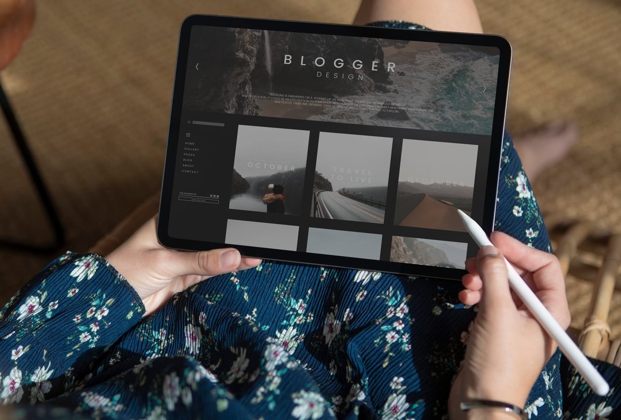
This is the most popular and reliable hero layout. The left side contains the headline, subheadline, and CTA. The right side features a product screenshot, illustration, or photo.
Why it works: In left-to-right reading cultures, the eye naturally starts on the left. Placing your value proposition there ensures it gets read first. The visual on the right reinforces the message and provides context.
Best for: SaaS products, tech companies, B2B services, apps.
2. The Centered Layout
All text is centered on the page with the CTA button directly below. A background image, gradient, or video sits behind the text.
Why it works: It creates a clean, focused hierarchy. There is no visual competition. The visitor reads the headline, then the subheadline, then clicks the button. It follows a natural vertical scanning pattern.
Best for: Landing pages, event websites, product launches, portfolios.
3. The Full-Screen Video Background
A looping video fills the entire hero section with a semi-transparent overlay and centered text on top.
Why it works: Motion captures attention. When the video directly shows the product in use or the experience being sold, it can be incredibly persuasive.
Best for: Travel, hospitality, real estate, lifestyle brands.
Caution: Video backgrounds must be optimized for performance. A slow-loading hero destroys conversions.
4. The Product-Focused Layout
The hero section features a large product image or device mockup as the central element, with minimal text above or below.
Why it works: When the product itself is visually compelling, letting it take center stage can be more persuasive than any headline. Apple has used this approach for decades.
Best for: Physical products, hardware, consumer electronics, fashion.
5. The Interactive or Animated Hero
Elements animate in as the page loads, or the hero contains an interactive component like a search bar, calculator, or configurator.
Why it works: Interactive elements increase engagement and time on page. They also let visitors self-qualify and get value immediately.
Best for: Travel booking sites, real estate platforms, financial tools, comparison services.
How to Write Hero Section Headlines That Convert
Your headline is the single most important piece of copy on your entire website. If it fails, nothing else matters.
Here are proven formulas for writing hero section headlines:
Formula 1: Say What You Are
This sounds obvious, but an astonishing number of websites fail at this basic task. Your headline should tell visitors exactly what you do in plain language.
Example: “Project management software for remote teams” is better than “Reimagine the future of work.”
Formula 2: Lead With the Benefit
Instead of describing what your product is, describe what it does for the customer.
Example: “Get paid 3x faster with automated invoicing” instead of “Automated invoicing software.”
Formula 3: Address the Pain Point
Call out the problem your audience is experiencing, then position your product as the solution.
Example: “Tired of losing deals to slow follow-ups? Automate your outreach in minutes.”
Formula 4: Use Specificity and Numbers
Specific claims are more believable than vague ones. Numbers add credibility.
Example: “Join 50,000+ marketers who increased their conversion rates by 37%.”
Headline Writing Best Practices
- Keep it under 10 words if possible. Shorter headlines get read more.
- Use simple, everyday language. Avoid jargon unless your audience expects it.
- Make your offer different. As one popular framework puts it: say what you are, then say what makes your offer different.
- Follow the “one idea, one image” rule. Let your heading resonate with and reinforce the accompanying visual.
- Test multiple versions. A/B testing headlines is one of the most cost-effective conversion optimization activities you can do.
The Subheadline
Your subheadline should expand on the headline with additional context. It typically answers one of these questions:
- How does it work?
- Who is it for?
- What specific result can I expect?
- Why should I trust this?
Keep it to one or two sentences. Any longer and it won’t get read.
CTA Button Design and Placement Best Practices
The CTA (call to action) button is where conversions actually happen. Getting the design, placement, copy, and hierarchy right is critical.
CTA Design Rules
- Make it visually prominent. Use a contrasting color that stands out from the rest of the hero section. If your hero background is dark, use a bright button color.
- Size matters. The button should be large enough to be immediately noticeable but not so large that it feels aggressive. A minimum of 44px height for touch targets on mobile.
- Use whitespace around the button. Give it room to breathe so it does not get lost in surrounding elements.
- Add a subtle hover effect. This provides feedback and encourages clicks on desktop.
CTA Copy That Drives Clicks
Use action-oriented language that tells visitors exactly what will happen when they click.
| Weak CTA | Strong CTA | Why It’s Better |
|---|---|---|
| Submit | Get My Free Report | Specifies the value received |
| Learn More | See How It Works | More specific and curiosity-driven |
| Sign Up | Start Your Free Trial | Reduces perceived risk with “free” |
| Click Here | Build Your Website Now | Action-oriented and outcome-focused |
CTA Placement Strategy
Place your primary CTA directly below the headline and subheadline. The natural reading flow should take the visitor from headline to subheadline to button without any friction.
Primary vs. secondary CTAs: If you have two possible actions (for example, “Start Free Trial” and “Watch Demo”), make one visually dominant (solid, bright button) and the other secondary (outlined or text link). Never give two CTAs equal visual weight.
Reducing anxiety near the CTA: Add a small line of text below the button that addresses objections. Examples include “No credit card required,” “Free for 14 days,” or “Takes less than 2 minutes.”
Choosing the Right Background Imagery
The visual component of your hero section can make or break the entire design. Here is how to choose wisely.
Photography
- Use authentic, high-quality photos. Generic stock photos with fake smiles actively harm trust.
- Show real people using your product or experiencing the outcome you promise.
- Ensure the image has enough contrast with your text. Use overlays (dark or light) to maintain readability.
Illustrations
- Custom illustrations can set your brand apart and are excellent for abstract concepts.
- They tend to load faster than large photos.
- Make sure the illustration style matches your overall brand identity.
Product Screenshots and Mockups
- If you are selling software, show the actual product interface. This builds trust and sets accurate expectations.
- Use device mockups (laptop, phone) to add context.
- Annotate key features if the screenshot alone is not self-explanatory.
Video Backgrounds
- Keep them short (10-30 seconds) and looping.
- Mute by default. Auto-playing sound is a conversion killer.
- Compress aggressively. Target under 5MB for the video file.
- Always provide a fallback static image for slow connections.
Gradients and Abstract Backgrounds
- Minimalist gradient backgrounds work well for text-heavy hero sections.
- They load instantly and never distract from the message.
- Pair with a strong product image or illustration for added visual interest.

Mobile Responsiveness: Designing the Hero for Every Screen
More than 60% of web traffic now comes from mobile devices. If your hero section does not work beautifully on a phone screen, you are losing the majority of your potential conversions.
Mobile Hero Section Best Practices
- Stack your layout vertically. The split layout (text left, image right) should become text on top, image below on mobile.
- Reduce hero height. On mobile, your hero should occupy 50% to 70% of the viewport. Going full-screen on mobile pushes all other content too far down.
- Increase font sizes proportionally. Headlines should remain large and bold. Do not let them shrink to body text size.
- Make the CTA thumb-friendly. Minimum 48px height, full-width or near full-width on small screens.
- Optimize images for mobile. Serve smaller image files using responsive image techniques (srcset). A 2MB hero image on a 4G connection is unacceptable.
- Hide or simplify decorative elements. Animations, floating elements, and complex illustrations that look great on desktop can feel cluttered on a 375px-wide screen.
- Test on real devices. Emulators miss real-world issues like text overflow, touch target overlap, and image cropping problems.
Real Examples of Effective Hero Sections (and Why They Work)
Let’s look at hero section patterns across different industries and analyze what makes them effective.
Example 1: SaaS Product (Project Management Tool)
Layout: Split layout with headline on the left, product screenshot on the right.
Headline: “Manage projects without the chaos.”
Subheadline: “One workspace for tasks, timelines, and team communication. Trusted by 30,000+ teams.”
CTA: “Start Free” (primary, bright green button) + “See a Demo” (secondary, outlined button).
Trust indicator: Row of customer logos below the CTA.
Why it works: The headline addresses a pain point (chaos), the subheadline adds specifics and social proof, the dual CTA accommodates both action-ready and research-phase visitors, and the product screenshot shows exactly what you get.
Example 2: E-Commerce (Direct-to-Consumer Fashion Brand)
Layout: Full-width lifestyle photo background with centered text overlay.
Headline: “Summer 2026 Collection”
Subheadline: “Designed for comfort. Built to last.”
CTA: “Shop the Collection” (single, bold white button).
Why it works: Fashion is visual by nature. The full-screen photo of a model wearing the product IS the sales pitch. The minimal text does not compete with the image. The single CTA makes the next step obvious.
Example 3: B2B Service (Marketing Agency)
Layout: Centered layout with gradient background and animated statistics.
Headline: “We help B2B companies generate 3x more qualified leads.”
Subheadline: “Full-service demand generation for mid-market tech companies.”
CTA: “Book a Strategy Call” (single, high-contrast orange button).
Trust indicator: “Rated 4.9/5 on Clutch” with a star graphic.
Why it works: The headline leads with a specific, measurable outcome. The subheadline narrows the audience (B2B, mid-market, tech), which actually increases conversion because the right visitors feel this is made for them. The CTA is low-commitment but high-intent.
Example 4: Local Business (Restaurant)
Layout: Full-screen video background showing food preparation, with a centered text block.
Headline: “Farm to table. No compromises.”
CTA: “Reserve a Table” (primary) + “View Menu” (secondary).
Why it works: For restaurants, video is incredibly effective because it triggers sensory associations. The dual CTA serves two common intents: people ready to book and people still deciding.
Example 5: Non-Profit Organization
Layout: Emotional hero photo with dark overlay and centered white text.
Headline: “Every child deserves clean water.”
Subheadline: “Your $25 donation provides safe drinking water for one family for an entire year.”
CTA: “Donate Now” (large yellow button).
Why it works: The emotional image creates empathy. The headline is simple and values-driven. The subheadline makes the impact tangible and specific. The bright CTA button stands out against the dark overlay.
Common Hero Section Mistakes to Avoid
Understanding how to design a hero section also means knowing what NOT to do. These are the most frequent mistakes we see:
- Vague headlines. “Welcome to our website” or “Innovation meets excellence” says nothing. Be specific about what you offer and for whom.
- Too many CTAs. Three or more buttons in the hero create decision paralysis. Stick to one primary and one optional secondary CTA.
- Slow-loading visuals. A hero image over 500KB or an uncompressed video will tank your Core Web Vitals and your conversions. Optimize everything.
- Poor text-to-background contrast. If visitors have to squint to read your headline, they will leave instead. Always test readability.
- Ignoring mobile. Designing for desktop first and then hoping mobile “works out” is a recipe for lost revenue.
- Auto-playing video with sound. This is intrusive and will cause immediate bounces.
- No clear visual hierarchy. When everything is bold or everything is the same size, nothing stands out. Guide the eye deliberately.
- Using sliders or carousels. Research consistently shows that hero sliders reduce conversions. Commit to one message instead of rotating through four.

A Step-by-Step Process for Designing Your Hero Section
Here is a practical, repeatable process you can follow:
- Define the goal. What is the single most important action you want visitors to take? Everything in the hero section should support that action.
- Write the headline first. Before touching any design tool, nail the headline. Write at least 10 variations and pick the clearest, most compelling one.
- Write the subheadline. Add one or two sentences of supporting context.
- Choose your CTA copy. Make it action-oriented and specific.
- Select your layout pattern. Use one of the five patterns discussed above based on your industry and content.
- Choose or create your visual. Photo, illustration, screenshot, or video. Make sure it reinforces the headline.
- Design the desktop version. Build with visual hierarchy in mind: headline first, subheadline second, CTA third.
- Adapt for mobile. Stack elements, resize images, and test touch targets.
- Add trust indicators. Logos, ratings, testimonials, or user counts placed near the CTA to reduce friction.
- Test and iterate. Launch, measure, and improve. Use heatmaps to see where visitors look and click. A/B test headlines and CTA copy regularly.
Hero Section Performance Checklist
Before you publish, run through this quick checklist:
- ☑ Headline clearly communicates what you offer
- ☑ Subheadline adds context or social proof
- ☑ Primary CTA is visually dominant and uses action language
- ☑ Visual reinforces the message (not just decoration)
- ☑ Text is readable on all background areas
- ☑ Hero loads in under 2.5 seconds (Largest Contentful Paint target)
- ☑ Mobile layout is tested on real devices
- ☑ No more than two CTAs
- ☑ Trust indicators are present near the CTA
- ☑ No auto-playing audio
Frequently Asked Questions
What is the ideal height for a hero section?
On desktop, your hero section should typically occupy 60% to 100% of the viewport height, depending on the amount of content and your layout pattern. On mobile, 50% to 70% of the viewport height is recommended so users can see a hint of the content below and are encouraged to scroll.
Should I use a video or an image for my hero background?
It depends on your product and audience. Video works best when motion adds value, such as showcasing a physical experience (travel, food, real estate). Images or illustrations are better when you need fast load times and clear messaging. Always prioritize performance; a fast-loading image beats a slow-loading video every time.
How many CTAs should a hero section have?
One primary CTA is ideal. You can optionally include one secondary CTA for visitors who need more information before committing (for example, “Watch Demo” alongside “Start Free Trial”). Never use more than two CTAs in the hero section.
How do I create a hero section in HTML and CSS?
A basic hero section uses a full-width container with a background image or color, a heading tag for the headline, a paragraph for the subheadline, and a styled anchor or button element for the CTA. Use flexbox or CSS grid for layout, and media queries for mobile responsiveness. If you use a framework like Express.js for your backend, your hero section templating can be handled through any front-end view engine or static HTML.
What makes a hero section headline effective?
An effective headline is clear, specific, and benefit-oriented. It tells visitors what you offer and why it matters to them. Avoid vague or clever headlines that require context to understand. Specificity (numbers, outcomes, audience) always outperforms generic messaging.
Should I use a carousel or slider in my hero section?
No. Multiple studies have shown that carousels and sliders reduce engagement and conversions. Most visitors only see the first slide, and the rotating content creates distraction rather than focus. Commit to one strong message instead.
How do I make my hero section load faster?
Compress all images using modern formats like WebP or AVIF. Lazy-load elements below the fold but prioritize loading the hero image. Use responsive image srcset attributes to serve appropriately sized images for each device. For video backgrounds, compress aggressively and always include a static image fallback.